Menu
A creative atelier curating brand and web designs for women-owned businesses.I design and curate intentional brand designs and websites to cultivate your idea and bring your value out there.
A creative atelier curating brand and web designs for women-owned businesses.I design and curate intentional brand designs and websites to cultivate your idea and bring your value out there.
I’ve been working at websites design full-time for the past 3 years, not to mention the many years of training before that. I can say I’ve seen a huge variety of websites, as much so that I could actually group them by type: the text-only website, the sliders website, the informal website… and even the mythological brochure website! And, for sure, I’ve seen a lot of common website mistakes along the way.
See, the thing is most of us can’t afford to pay a whole team of people to always keep our websites updated and spot-on. Which is understandable. Also we’re not all website experts and know very little about the user experience science. As a result, most of us try their best to keep their websites consistent and updated, in-between of all the other one million tasks we approach daily as entrepreneurs, hoping our efforts won’t go against some essential physical laws we’re most likely not aware of.
So let me try and share a little of my expertise in this field, and list down the top 3 most common website mistakes you should definitely avoid. Avoid these and you’re already half way through the work of making your website a functional, strategic and welcoming space!
Here you go, the top 3 most common website mistakes:
Based on your business type, before creating your website (whether you’re doing it with a designer or on your own), you’ve surely spent a good couple of weeks looking out at competitors for inspiration. The tendency is surely to try and fall into line with whatever seems to be working in your market. As a result, most illustrators have a portfolio-website, most photographers a slider-website, and so on…
But listen, it’s not proven science that what’s apparently working for others in your same field, is a correct practice and will work for you too. There are practices, especially in visual businesses (photographers, illustrators, designers, stylists – I’m looking at you), that are surely all but beneficial to any businesses.
The most common between this is the no-text homepage.
If your homepage only includes a big slider of your stunning photography or a grid of images of your latest design work, that’s not enough. Sure, your visual work is what will serve your clients, but doesn’t really communicate your message on its own. At least not in the same way as words would do.
Your perspective clients need more than just images. They need to know they’re being heard and seen by you. To be able to identify themselves in the exact person you’re talking to with your website copy. They need to instantly be able to tell if you are offering what they are looking for, and if your services answers their need.
This doesn’t mean you should cut down on images, but you should definitely balance them out with a good portion of text. Remember your entire website should be made of 30% images and 70% text, and your homepage is no exception.
To determine whether your homepage is rich or poor in content, remember the homepage is a page of your website you should be able to scroll through (as the act of moving your scrollbar from the top to the bottom of your screen). If your homepage can’t be scrolled, you should add some content right now.
Lastly, remember a homepage, just like any other page of your website, should come at least with 300 words (as bare minimum) to appeal to search engines and rank nicely in search.
So… go add some keywords-dense and client-focused copy to your homepage – I mean, now!
Want more homepage tips? Go read my Anatomy Of A Perfect Homepage guide >
OK, I know how you feel. Having pictures of you taken is not your bread and butter. You much prefer showing off your art, products or perfectly-organised workspace. I get it.
But this can’t justify the complete lack of about photos on your website. Literally, one of the worst most common website mistakes out there!
As small business owners, we’re firstly individuals and real people. And when a client wants to buy from us, he wants to buy from a real tangible person. Most times than not our products and services are handmade, unique and customised. People want to buy from small businesses because they prefer buying from real people than from big chains or agencies.
What people want is to empathise, find connection, build human relationships. And when your business is mostly or fully online, you don’t get much of a chance to show your face if not through your about photos.
If potential clients landing on your website don’t find any photos portraying who’s behind-the-scenes, they might start wondering whether that same site is trustworthy. Whether the person behind it is actually real at all.
Having at least a pinch of your own face thrown in in your branding photography and website, instead, allows the user to immediately empathise with you and create a human connection he’ll want to pursue.
Especially if you’re not an expert in the websites field and you’ve decided to DIY your website, you’re likely to fall in the mistake of creating a you-centric website. It’s way too easy not to!
You might write your own website copy, which is great. And it might seem you should be talking about you – a lot. From the homepage, to the services, not to mention the about page! It’s tempting to start most of the sentences like “I am, I studied, I graduated, I imagine, I do…”. But your content shouldn’t be about you, at least not most of it, but about your clients instead.
Your website copy isn’t supposed to list down your masters and degrees or your favourite colour. Instead it should answer your ideal clients needs and make them feel like you’re talking to them directly.
Yes, your about page might talk about you too. It’s important to show your personality and prefrences to create human connections based on similarities. But remember a solid 90% of your website should be client-centric instead of about you.
At the same time, your you-centric approach might keep you from spotting some important lack in quality in your website’s user experience. You’ve planned and organised your website so meticoulosly well and in your mind it works like a charm. Because YOU created it, and you know the logic behind it. But your users will be completely extraneous to your idea of order! What it seems crystal clear to you, might not be very user-friendly for someone who never really met you before.
To sum it up, always put yourself in your users’ shoes and create an experience that is made for them more than it is for you only.
And there you have it, the top 3 most common website mistakes I spot most frequently in my work as a website designer. As you can tell, they’re nothing you can’t fix yourself in the right immediate – so you have no excuses!
It’s your turn, go make your website a better place for your people. You can thank me later!

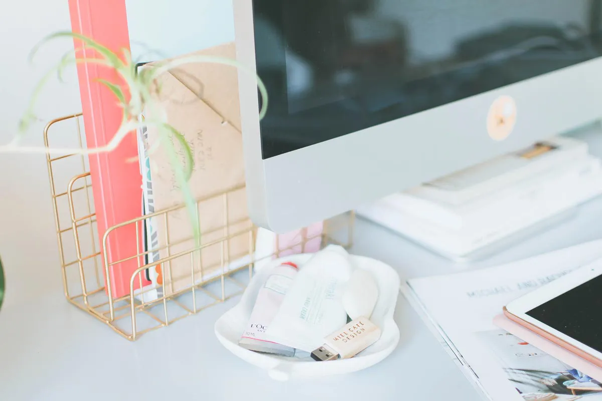
I'm Giada Correale, brand and web designer of Miel Cafè Design graphic studio. I design intentional and editorial brand identities and web designs for heartfelt women-owned businesses.
I'm Giada Correale, brand and web designer of Miel Cafè Design graphic studio. I design intentional and editorial brand identities and web designs for heartfelt women-owned businesses.
A creative atelier curating brand and web designs for women-owned businesses.
I design and curate intentional brand designs and websites to cultivate your idea and bring your value out there.