Menu
A creative atelier curating brand and web designs for women-owned businesses.I design and curate intentional brand designs and websites to cultivate your idea and bring your value out there.
A creative atelier curating brand and web designs for women-owned businesses.I design and curate intentional brand designs and websites to cultivate your idea and bring your value out there.
Being a brand and web designer who works at custom designs on a daily basis, it’s more often than not that I get asked questions like:
What should I include in my website?
How should I structure the perfect homepage?
Should I keep it minimal or go full on?
How much is too much?
I get it. You’re doing a website overall, which is a big job in its own, and you want to have it done properly. I bet any creatives or small business owners who run a website have been there at some point.
While my clients get specific help to try and identify what’s worth to include, I also wanted to share my wisdom with anyone who is in the same position. And after having replied to those same questions for over 2 years, you can be sure your Qs will be answered in this post! Let’s dive straight in…

A couple of things:
I always like to say your homepage is your online business card. It’s most likely the first page a potential client sees when landing on your corner of the internet. And if it’s not (maybe they found you through a blog post or a static page), it’ll surely be the second destination for users to know more about the website they’re visiting.
This means the homepage is your chance to make sure potential clients know you’re talking to them directly. That they’re the exact person your business or website is there for. And that you have something valuable to offer!
So to answer the question: should I keep it minimal or go full on?
This is totally up to you and your business personality, but in general I suggest you go full on. You have just one chance for potential clients to decide to explore your website deeper, you want to make the most out of it!
What does this mean? Simply make sure all your offerings are stated somewhere in your homepage, with the right priority: services, blog, newsletter, courses, workshops, freebies, you name it! Anything you’re offering to your ideal client counts and it’s worth mentioning!
I generally suggest you follow a priority hierarchy with the most valuable/profitable offerings on top (these could be your services for your ideal client) and the less fundamental offerings to follow.

The anatomy of a perfect homepage should be structured similarly to this:
But of course I suggest you note down all your offerings and take some time to properly consider your priority hierarchy based on what’s most fundamental for your particular business.
Let’s dive in a little deeper…
Generally this section is in what’s called “above the fold” area, which basically means in about the first 1000px of the page. This is the area that’s usually visible even without scrolling down through the page. And so the area that should make the spark of interest flare in your ideal client!
What to include?
An introduction about your website/business, a welcome message, an image slider, a full-width image or even an images collage. Visuals work best here.
Once you have your ideal client interest, the first thing you want to make sure he sees is your most profitable offerings. These are generally the services you offer or the products you sell. Maybe, if you own an online shop, your top products categories. Or, if you run a blog, your most popular series and columns.
What to include?
Visuals accompanying titles and small descriptions for your top offerings. Photography works well here, but even icons or illustrations are good ideas if you have some within your brand board!
Most businesses are made of human relationships, whether you sell services or products. And to me there’s nothing more essential than starting building that relationship with your ideal client as soon as he visits your website.
It’s about building empathy and showing the humanity of your business. But even exciting curiosity in your ideal clientele to discover more about the behind-the-scenes. How you work, who you are and why they should pick you!
What to include?
A picture of you at work, together with a brief text and a button leading to your About Page.
Something I can’t stress enough is the importance of a good quantity of inputs to subscribe to your newsletter, if you have one (and you should!). You have just one chance to get your ideal clientele in your mailing list straight away – and you know how valuable that is! Make sure it counts.
Don’t be afraid to go a little wild with the number of newsletter forms you include in your website, and make sure it has a special place in your homepage as well. You’re not looking spammy, it’s scientific evidence that people will see half of the number you see! (Not really, but you get the point).
What to include?
A brief introduction text with a mention to any special offers or freebies dedicated to newsletter subscribers, a full embedded form to subscribe without even leaving the page.
While the previous sections are usually the same for most websites, based on your business type and the rest of your offerings, you might want to include some more areas here. Remember you’re supposed to state anything you’re offering! Maybe you run a blog, or have some nice testimonials to share, or you have a physical shop you want the user to see a map for…
What to include?
Your blog’s latest posts, your portfolio preview/directory, your course, your next workshop, testimonials, a map, or anything extra you have to offer.
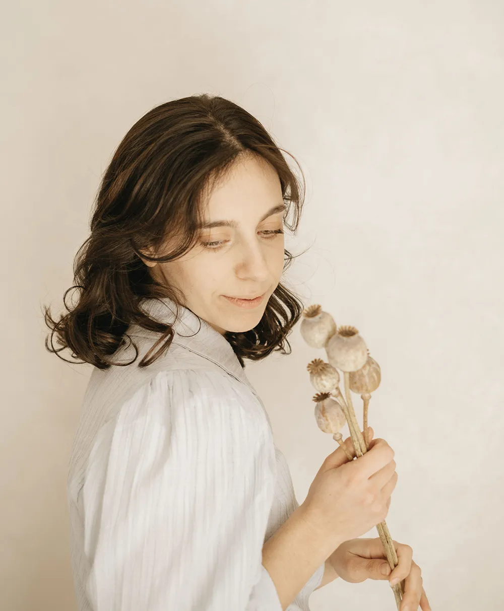
I'm Giada Correale, brand and web designer of Miel Cafè Design graphic studio. I design intentional and editorial brand identities and web designs for heartfelt women-owned businesses.
I'm Giada Correale, brand and web designer of Miel Cafè Design graphic studio. I design intentional and editorial brand identities and web designs for heartfelt women-owned businesses.
A creative atelier curating brand and web designs for women-owned businesses.
I design and curate intentional brand designs and websites to cultivate your idea and bring your value out there.
"it’s scientific evidence that people will see half of the number you see! (Not really, but you get the point)." <--- I didn't know this! Going to add more places to sign up for my newsletter now
[…] If you want to know more about the anatomy of a perfect homepage, read here. […]
[…] should be structured in blocks and arranged in a priority order. You can check out my guide on how to build a perfect homepage to learn more about this […]
[…] invece vuoi dare una rinfrescata al sito ecco due articoli con l’anatomia dell’homepage perfetta e 3 cose da fare per rinfrescare e migliorare il tuo sito. Visto che uno dei focus oggi è la […]
[…] Want more homepage tips? Go read my Anatomy Of A Perfect Homepage guide > […]
[…] you have your goal definitely, it will be easy to prioritise and position your content and also use links and call-to-actions to bring the user from A to […]
[…] second to the homepage, about pages are on top of the list of website pages that leave my web design clients confused when […]