Menu
A creative atelier curating brand and web designs for women-owned businesses.I design and curate intentional brand designs and websites to cultivate your idea and bring your value out there.
A creative atelier curating brand and web designs for women-owned businesses.I design and curate intentional brand designs and websites to cultivate your idea and bring your value out there.
User experience (or UX) can sound quite a daunting and pros-only science. When in reality, if you have a website, you own the essential requirement for which user experience is something you yourself should worry about. I prefer to call it the art and science of bringing your users on a journey and taking care of him in the meanwhile, sounds better right? And because user experience shouldn’t be something to shy away from, today I’m sharing my top 3 favourite hacks and website user experience best practices to bring your website to the next level – ready?!
While designing a website that feels unique, personal and different can feel tempting (and is actually a perfectly decent idea to stand out in a saturared market), it’s important that your uniqueness never compromises on simplicity and clarity.
When you’re designing your website, whether you’re taking care of it yourself or working with a professional, don’t try and overcomplicate things just for the sake of pure aesthetic pride, because complicated is the one quality that can often lead to bad user experience.
Keep the main design elements as standard as possible instead of extremely creative: your buttons should look like buttons; your navigation menu should be located horizontally under or above the logo; that same menu shouldn’t include more than 5-6 tabs; fonts and colors should always focus on readability. In general, whenever you have an option to standardize or customise, always prefer the first. You can infuse your creativity and artistic flair in other spaces of your online home, promised!
When crafting your website pages, your content should be purposefully crafted to enhance the user’s journey. It means deeply knowing your target and ideal user, but also understanding his needs with empathy.
Ask yourself: what is my ideal client looking for in this page of my website? What should it be his next step? If he has X problem and I have Y solution, how can I simplify his navigation to solve his problem? And, lastly, what is my ultimate goal with my website?
You can see user experience is much more about caring (for your people, your ideal clients) than it is about numbers and complicated designs tactics. Simply imagine your user’s journey and always offer a solution or a next step to keep the navigation smooth and interesting to his eyes. No page should be a dead end, unless your ideal user’s journey is completed on that page.
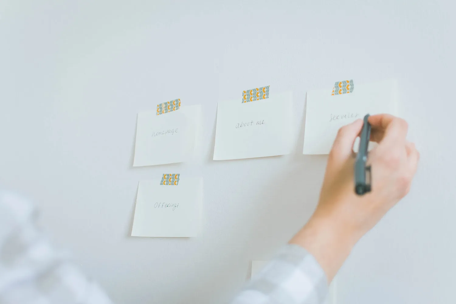
Remember any pages of your website should firstly and foremost be scannable. People’s attention span is quite low, especially when browsing websites. Users don’t read pages, they quickly scan them before deciding it’s worth diving deeper into the contents.
For this very reason, one of the most essential user experience best practices is to allow your pages to be scan-proof. Alternate texts with images, graphics, infographics, different sized headlines, bulleted lists… anything that can break big chunks of text and make your page easily digestible while capturing your user’s attention on some key words and points.

And there you have it! My top 3 website user experience best practices to turn your website into a strategic and caring space for your people. Implement these and you’ll not only make your users’ life easier, but they’ll start feeling heard and seen by you, enjoying their stay on your website and desiring to come back for more. They will never get lost on your website pages again, and you can finally start serving them as they deserve.
Now you know the best secrets of user experience, but how about structuring your contents and pages? I’ve got you covered: enroll my 4 Fatal Website Mistakes FREE email course to learn all by best website creation tips today >

I'm Giada Correale, brand and web designer of Miel Cafè Design graphic studio. I design intentional and editorial brand identities and web designs for heartfelt women-owned businesses.
I'm Giada Correale, brand and web designer of Miel Cafè Design graphic studio. I design intentional and editorial brand identities and web designs for heartfelt women-owned businesses.
A creative atelier curating brand and web designs for women-owned businesses.
I design and curate intentional brand designs and websites to cultivate your idea and bring your value out there.