Menu
A creative atelier curating brand and web designs for women-owned businesses.I design and curate intentional brand designs and websites to cultivate your idea and bring your value out there.
A creative atelier curating brand and web designs for women-owned businesses.I design and curate intentional brand designs and websites to cultivate your idea and bring your value out there.
Colors are a powerful tool for your brand. A sort of universal language which, thanks to nature, society and tradition, we all know and recognize since birth. This is how colors can communicate your message, as well as the atmosphere you want to recreate with your brand, without the use of words.
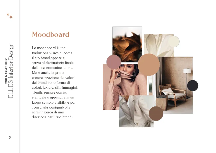
Today I want to show you the evolution of a color palette I’ve worked at in the past few months for Stefania, a client who’ll work with me at a complete branding and web design journey, but who needed to define her main brand styles a little earlier.
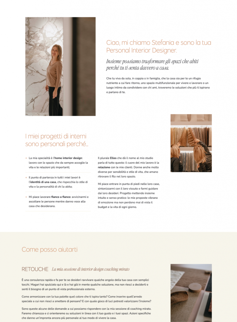
Stefania is a Personal Interior Design. What makes her brand unique is the feminine-only target, who needs their interiors to fully reflect their lifestyle and personality.
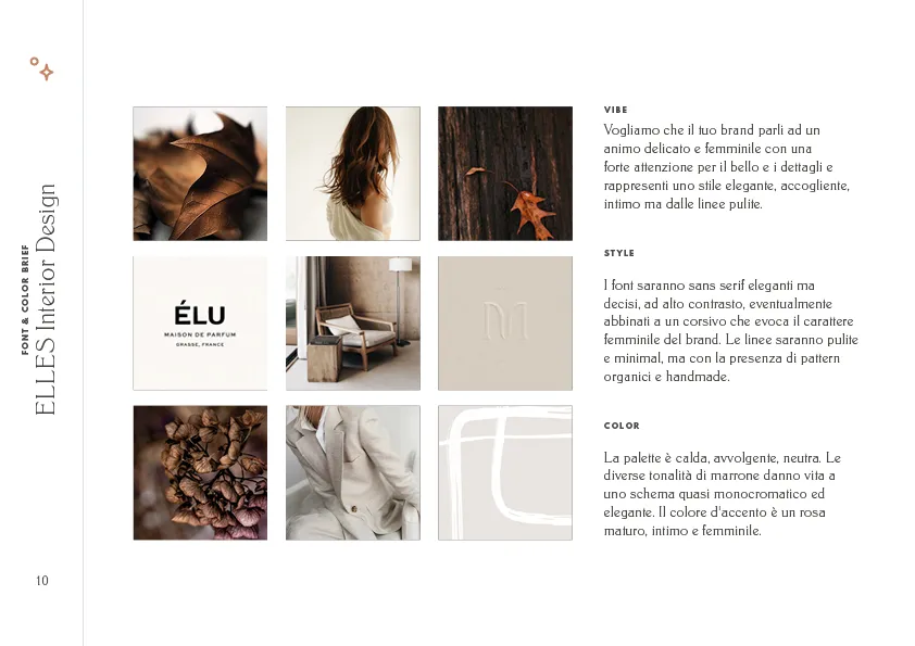
The brand is elegant, welcoming, warm, intimate, refined, feminine.
We started, as always, from a mood board to define the brand direction in a matter of colors, styles and fonts.
Next, I studied some color palette options based on color psychology, to provide the feels Stefania wanted to generate in her target.
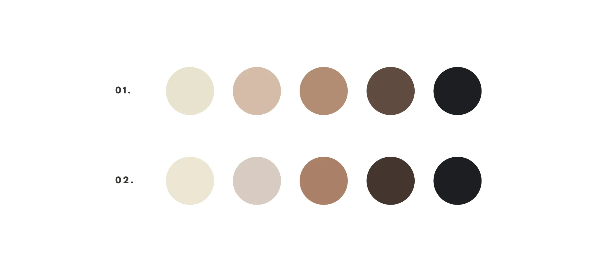
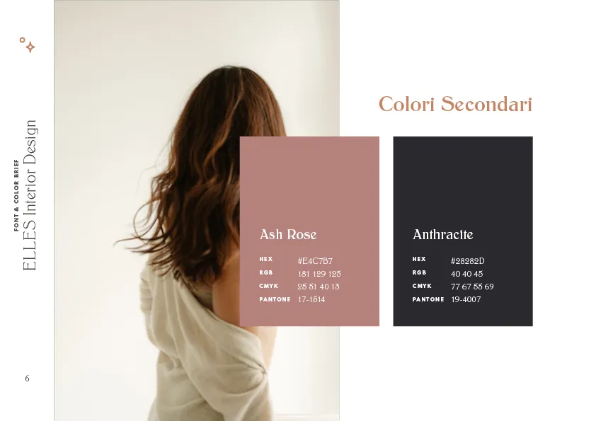
Stefania agreed on the almost-monochrome palette based on brown and vanilla tones, which feels warm and elegant. But she felt like she needed a more distinctive and mature feminine trait. This is when we focused on the pink choice, and then approved the final palette.
In addition, we also studied the font hierarchy together (do you know that fonts have a meaning too? And they’re deeply incisive when it comes to communicate the right atmosphere through your copy!)...
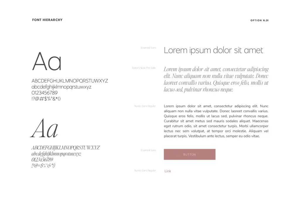
…and in general the brand styles direction.
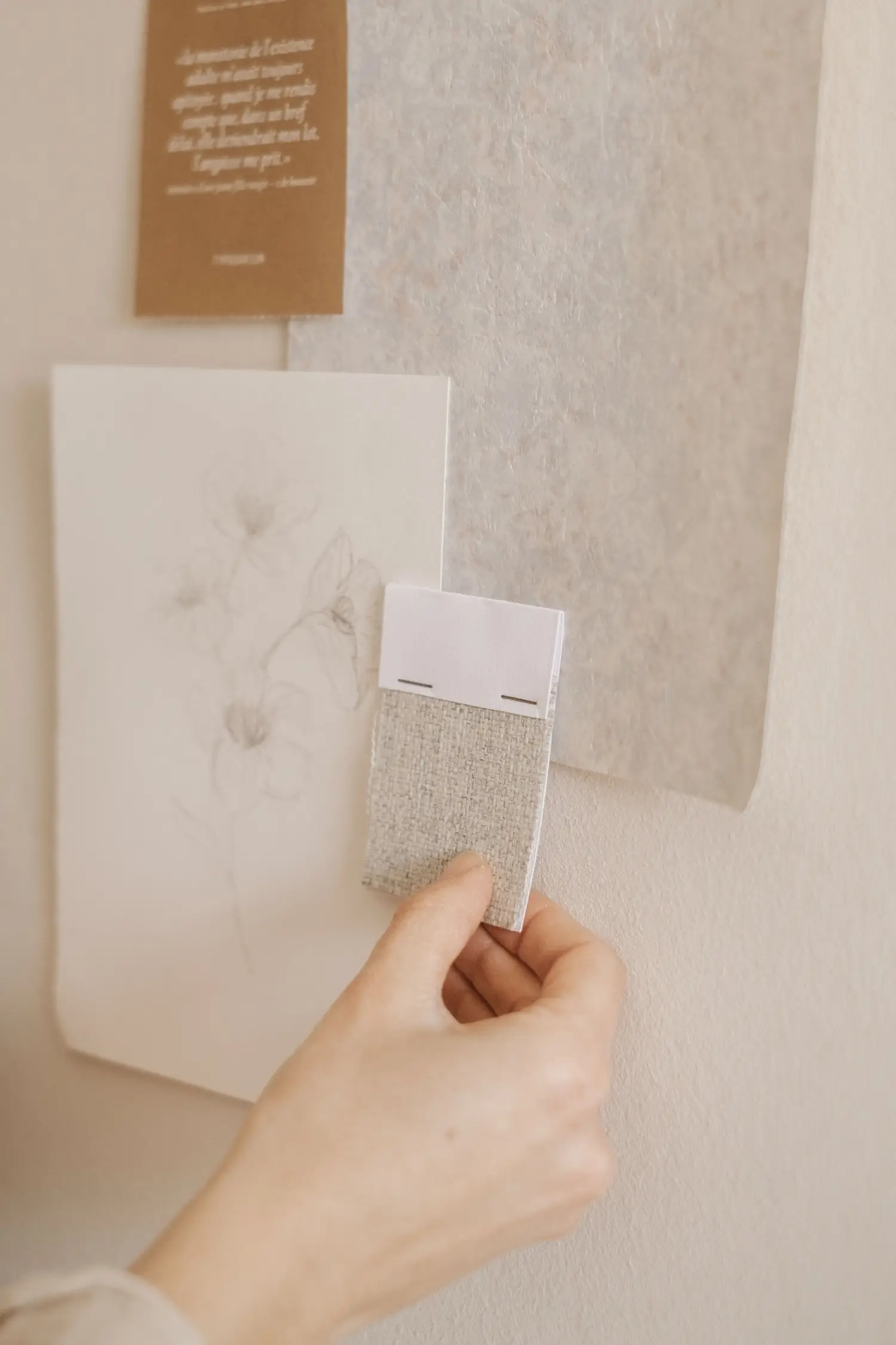
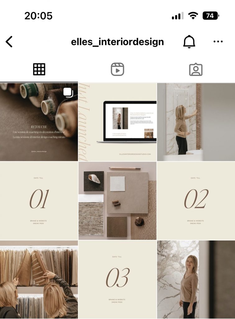
All this allowed Stefania to coordinate her branding photoshoot with her photographer in the most cohesive and professional way possible. Furthermore it allowed us to create a temporary landing page (while waiting for the complete website, coming soon), which already serves her brand to guide her potential clients and anticipate the brand’s atmosphere. With colors, styles and fonts Stefania can also coordinate her social media profiles, as she's already started doing in occasion of her landing page’s launch.
This is a wise way to use the time between booking and completing a brand and web design project with your designer, by starting to build brand awareness in the meanwhile. But I also highly recommend it if you’re not ready to invest in a definitive brand design yet, because even just colors and fonts will give your project coherency and strategy, and support it in its growth.
We can work at your branding bases with my service Petit Brand: an online consultancy service with no waiting times, to define your brand’s colors, fonts and styles to help you tell your story coherently and professionally from the very start.
And you — have you ever thought of the importance of colors for you brand?

I'm Giada Correale, brand and web designer of Miel Cafè Design graphic studio. I design intentional and editorial brand identities and web designs for heartfelt women-owned businesses.
I'm Giada Correale, brand and web designer of Miel Cafè Design graphic studio. I design intentional and editorial brand identities and web designs for heartfelt women-owned businesses.
A creative atelier curating brand and web designs for women-owned businesses.
I design and curate intentional brand designs and websites to cultivate your idea and bring your value out there.